by Precious Ambergris, Company Secretary:
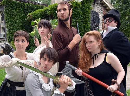 |
| (photo courtesy of Bad Dog Theatre) |
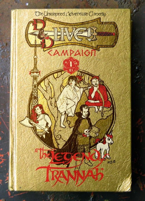 |
| ("D and D Live!" book by the men and women of the M.S.Co.) |
Yesterday the Company put the finishing touches on its submission for "Capaign 1: The Legend of T'ranna" -- the first instalment in the series.
Rather than its customary twodimentional gouache and ink on cardstock poster designs, the M.S.Co. saw fit to approach this assignment a little differently. The artwork was painted on the back of a book, alluding to the Dungeons and Dragons Player's Handbooks, and hopefully imbuing the show with the mildly nostalgic feel of young adult fantasy novel. In this instance the finished product isn't the illustration itself but a photo of the illustration on the book.
Rather than its customary twodimentional gouache and ink on cardstock poster designs, the M.S.Co. saw fit to approach this assignment a little differently. The artwork was painted on the back of a book, alluding to the Dungeons and Dragons Player's Handbooks, and hopefully imbuing the show with the mildly nostalgic feel of young adult fantasy novel. In this instance the finished product isn't the illustration itself but a photo of the illustration on the book.
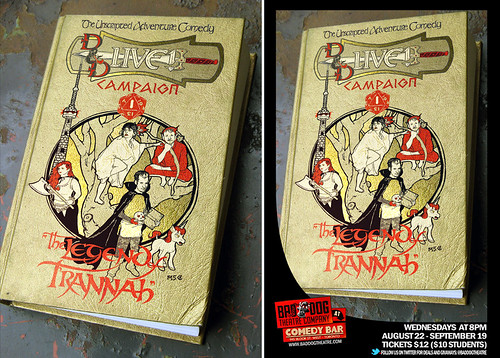
This departure in the Company's approach to design was brough about by Bad Dog's imposition of a black "swoosh" border and digital logos on the finished poster; a design element that simply didn't jive with the Misanthrope's usual style or colour palate. And while the Company feels it's come up with something that works, it is still the Misanthrope's unanimous opinion that this attempt at branding uniformity is as constricting to the designers as it is visually discordant.
The black "swoosh" is one thing, but the prominence of Bad Dog's logo is a little awkward, pulling the eye down to the bottom left of the poster away from much of text more relevant to the actual show. Nevertheless, a contract is a contract; a paycheque a paycheque, and cigar just a cigar. Chances are, at the end of the day, nobody but the easily annoyed Misanthropes will think that said border and logos mar their precious poster design. But anytime the Company members are in complete agreement about something is a day worth celebrating.
 |
| (Ms. Sakana's Twitter Dragon) |
The Misanthropes would also like to take this opportunity to point out their favourite detail on the poster: the redesigning of the twitter bird as sort of batty dragon. This finishing touch was snuck in in digitally in post-production by Company member Erkuden Sakana. A subtle bit of cuteness that tickles the Company more than anything possibly should. It's the little things, sometimes.
* * *



Hello! I just would like to give a huge thumbs up for the great info you have here on this post. I will be coming back to your blog for more soon. redspider.ae/service/graphic-design/
ReplyDelete